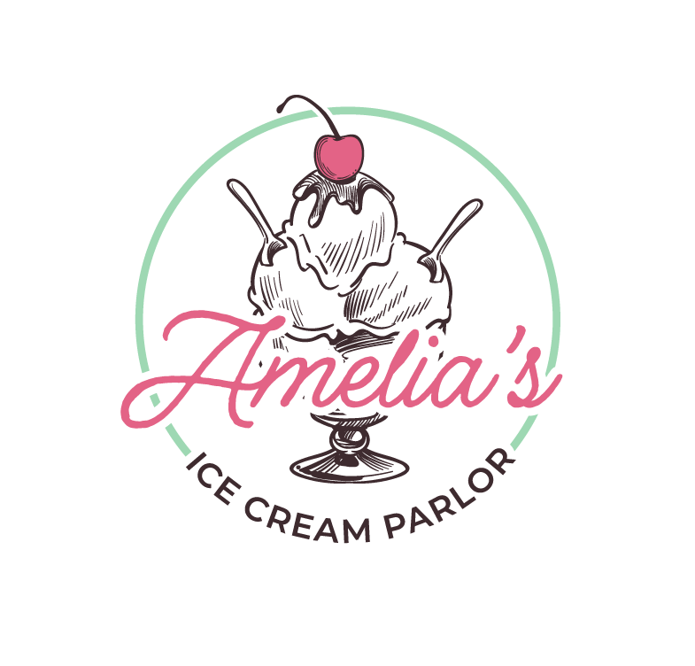
Named in honor of the owner’s mother, Amelia’s Ice Cream Parlor mixes old-world charm with modern taste. The client wanted a vintage-inspired brand to complement her homemade ice cream.
INSPIRATION, COMPETITOR COMPARISON, SKETCHES, & LOGO SELECT
The client provided some reference images as a launching point, and I developed some logo concepts for her to choose from, taking into consideration other local competing businesses.
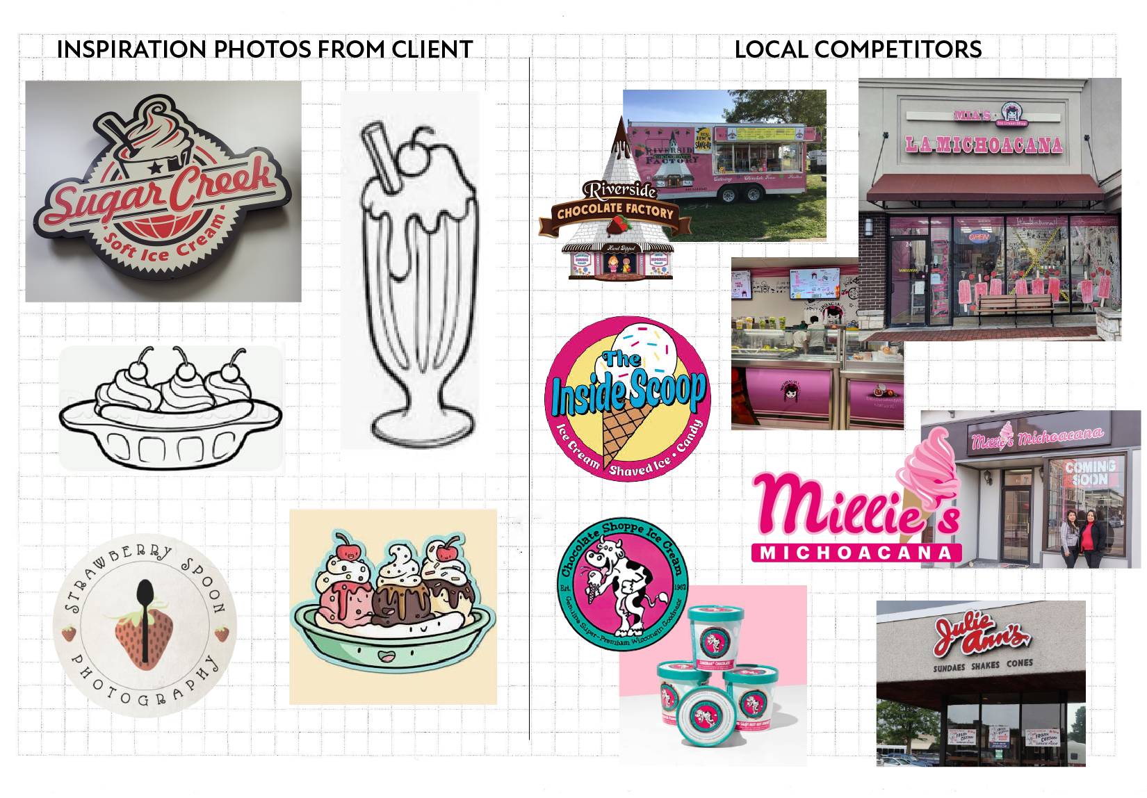
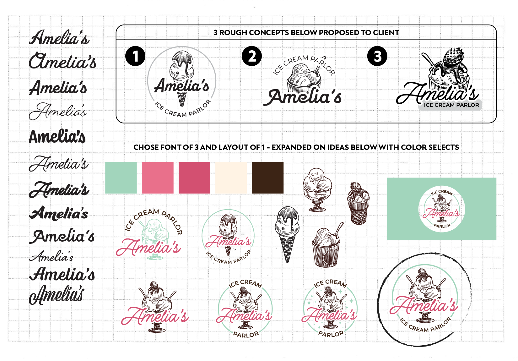
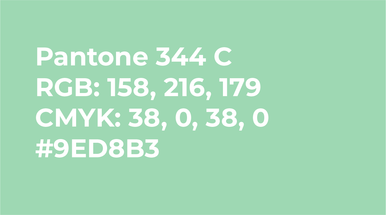
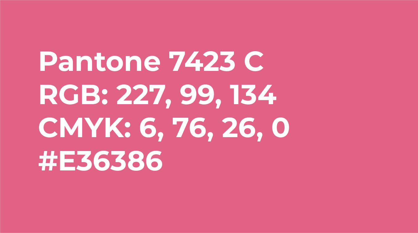
I leaned into the client's love of the color pink and vintage illustration, but opted for mint green as the primary color to stand out from local competitors. Ultimately the client chose the circled concept, but with a cherry on top instead of a strawberry.
BRAND GUIDELINES
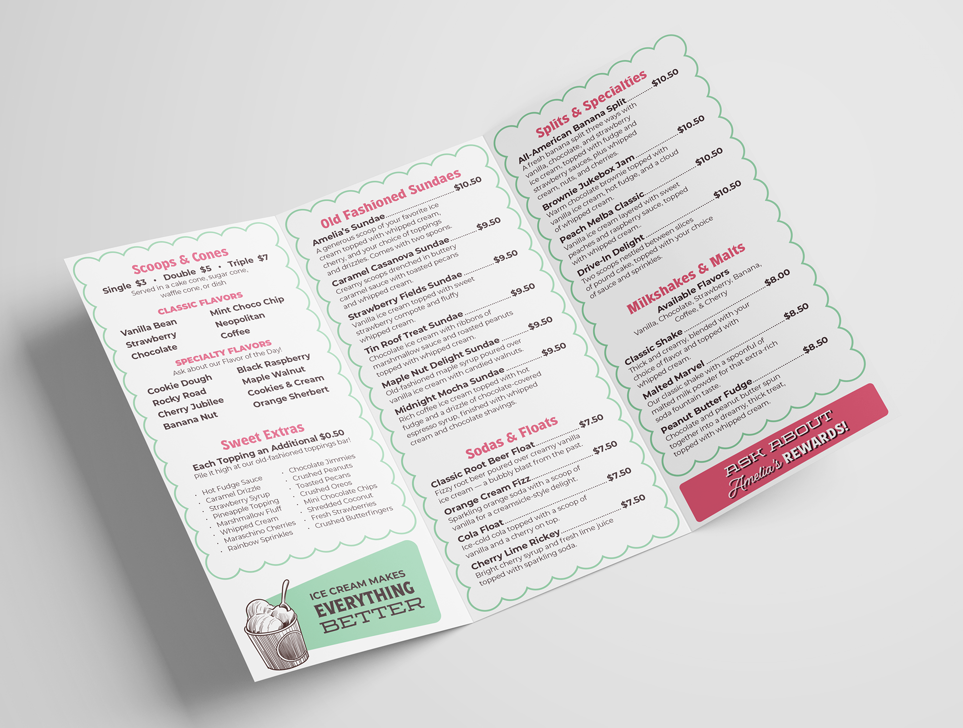
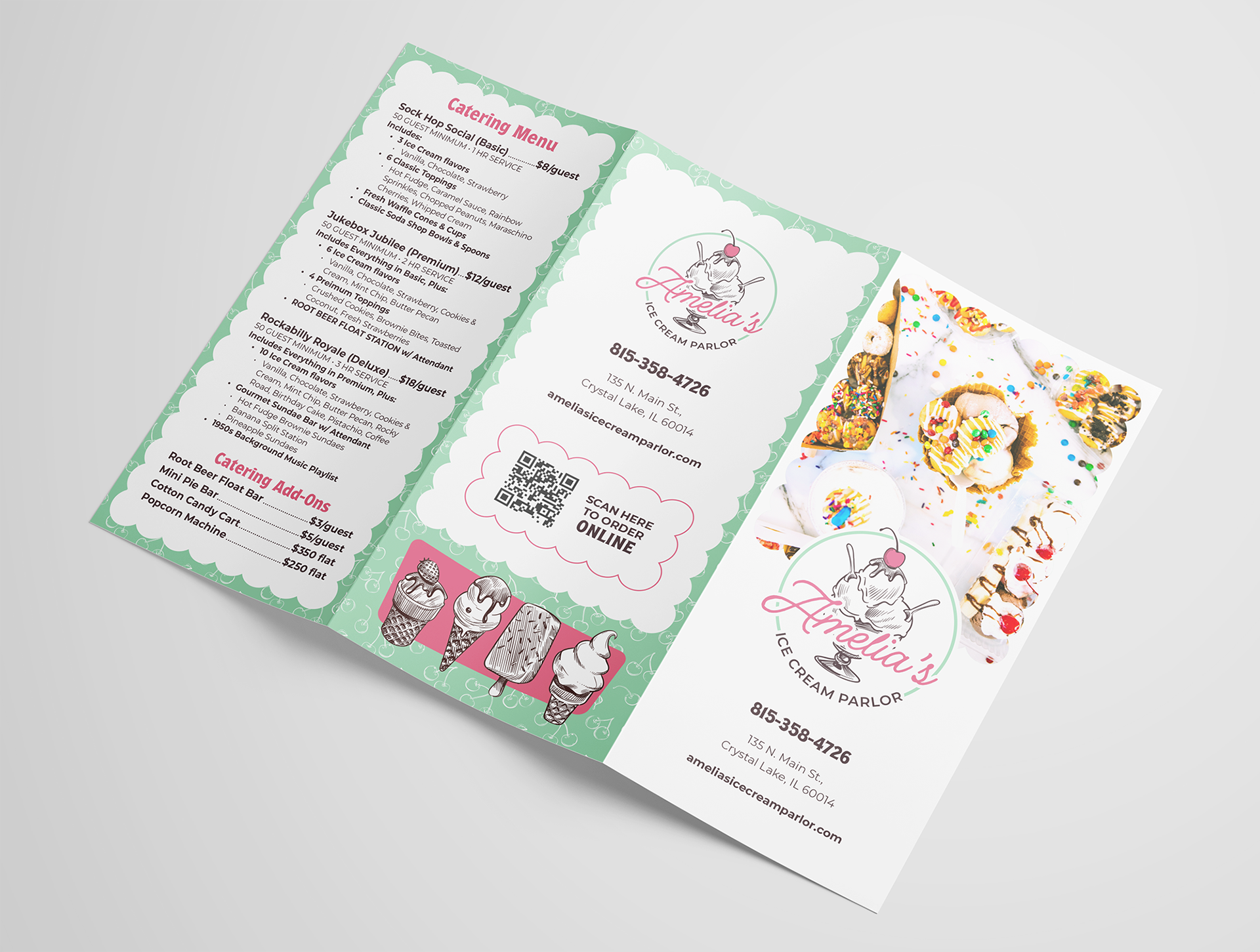
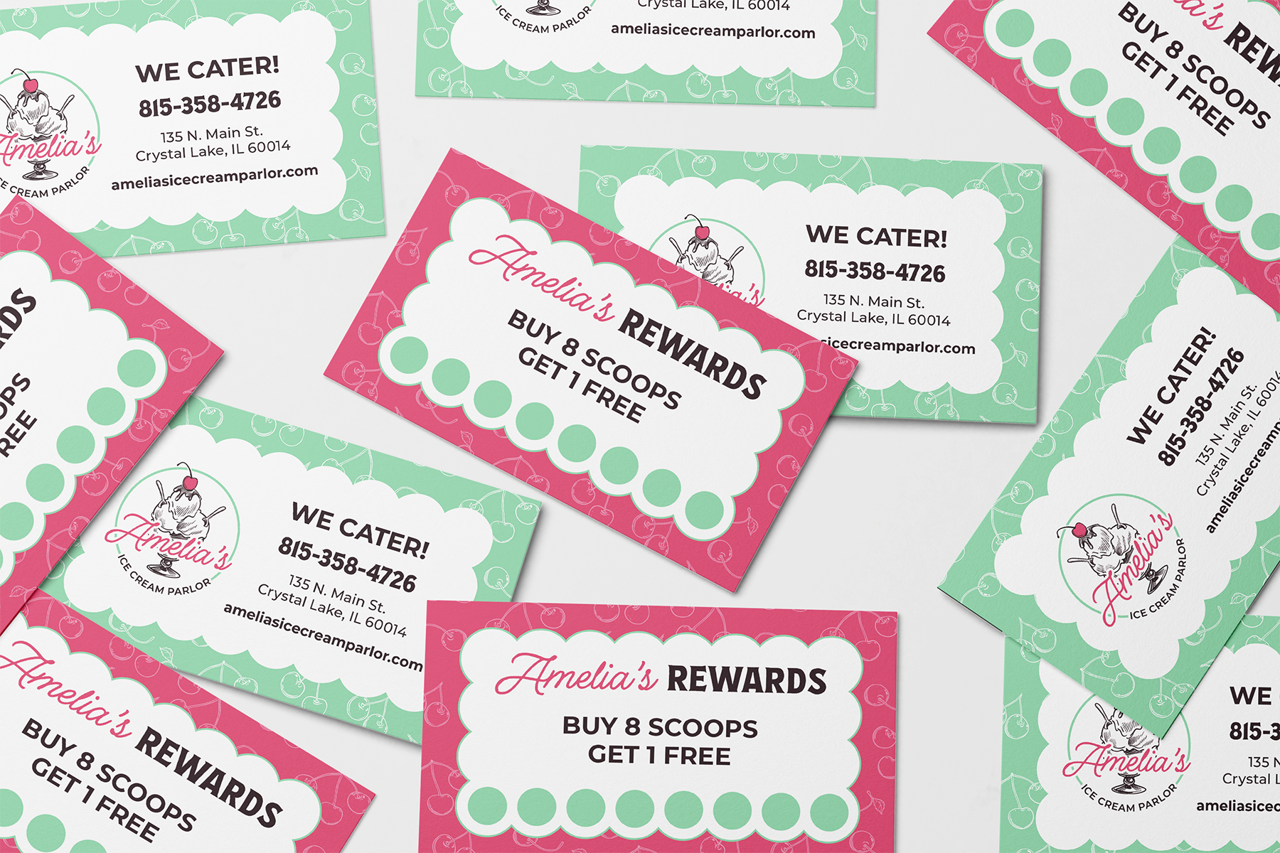
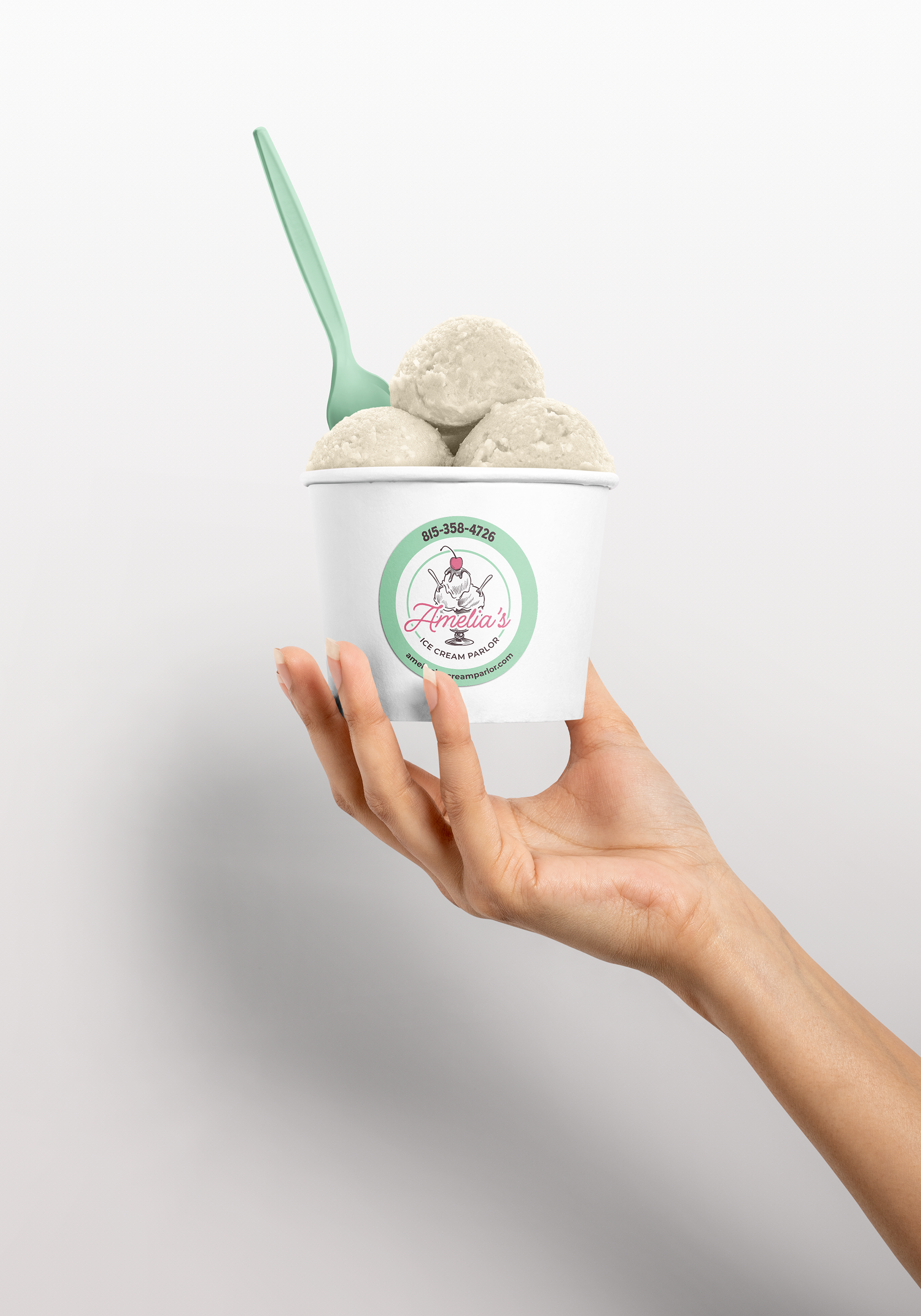
After the client selected the final logo, I expanded the brand guidelines and set out on designing the rest of the deliverables. A mix of approved and proposed deliverables are shown below. In the end the client loved her new brand and was set with a cohesive look for opening day.
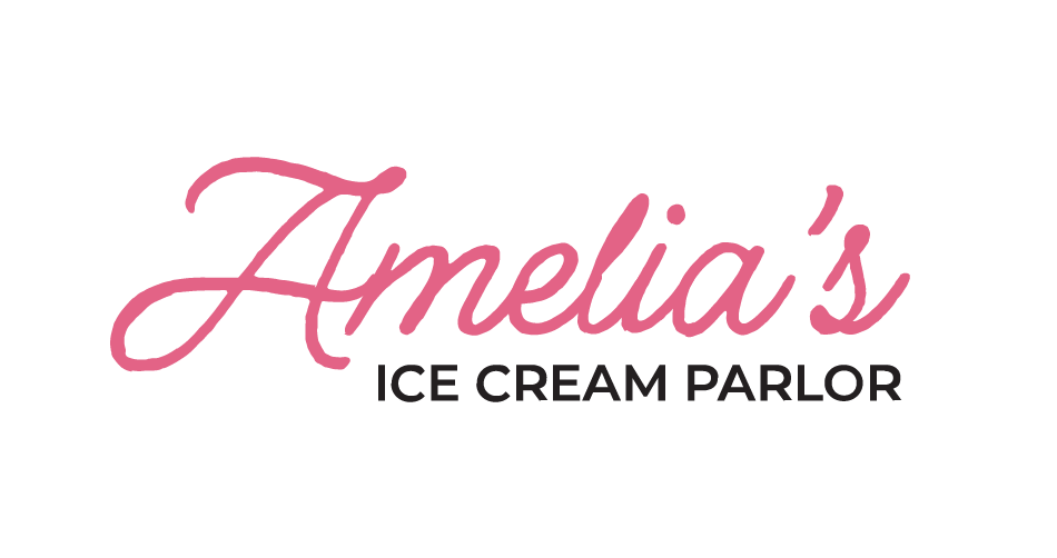
LOGO + WORDMARK

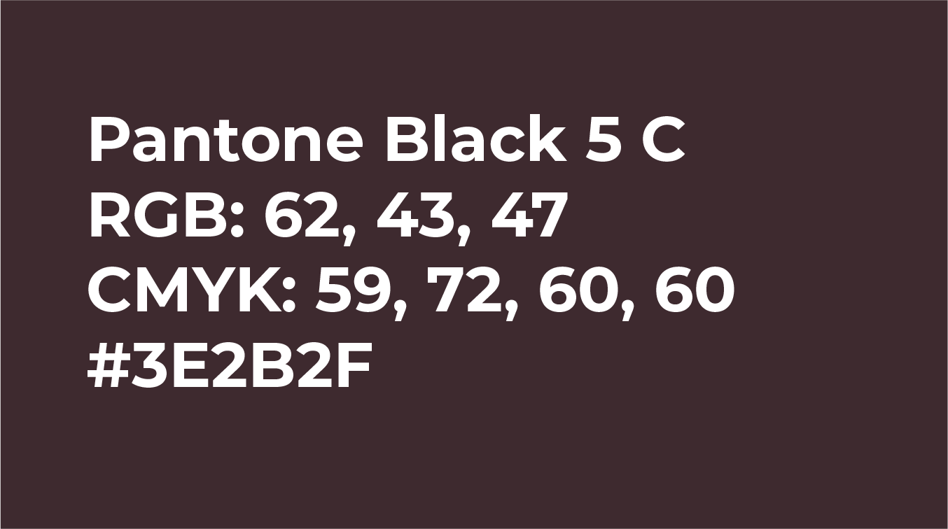
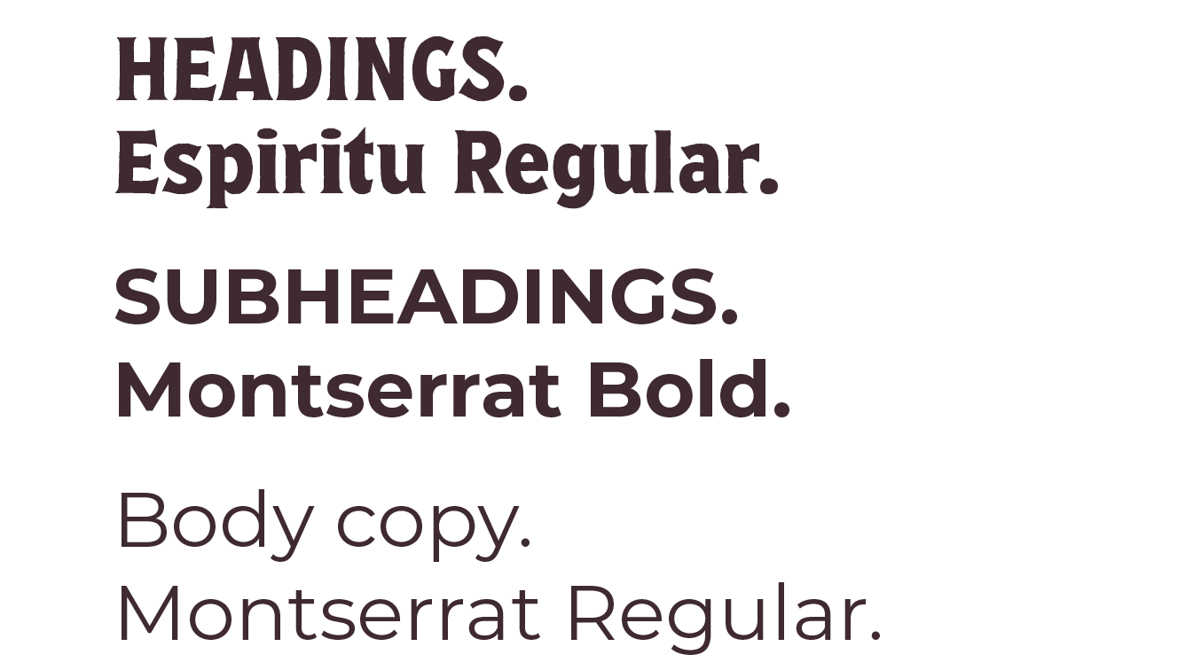
COLORS, FONTS, & PATTERNS


DELIVERABLES